Book Legacy: A Bold Display Font for Digital Brand Impact
It started with a hero section that felt… safe. Too safe. I was refining the homepage for a ceramicist’s new online shop—clean imagery, thoughtful spacing, strong product photography—but the headline just sat there, polite and unmemorable. I swapped in Book Legacy, typed “Hand-Thrown • Small Batch • Made in Portland,” and watched the whole layout exhale. Suddenly, the page had presence—not loudness, but grounded authority. That’s when I knew this wasn’t just another display font. It was a quiet confidence-builder for digital brands.
What Makes Book Legacy Stand Out on Screen
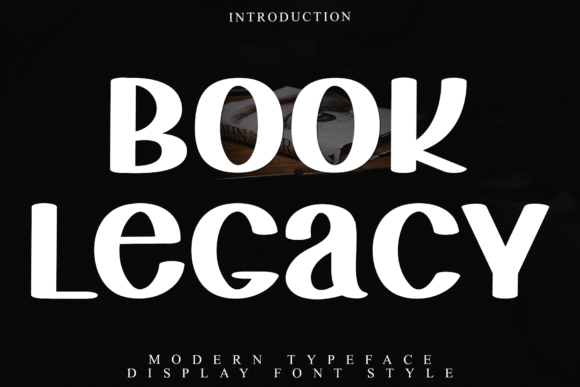
Book Legacy is a premium display font built for impact without sacrificing integrity. Its heavy, blocky letterforms carry weight and warmth—organic curves soften sharp edges, and that stable vertical axis gives it remarkable composure, even at small sizes or over textured backgrounds. Unlike many bold display fonts that lean into grit or distortion, Book Legacy feels intentional, human-made, and quietly modern. It doesn’t shout—it declares. And in web design, where first impressions happen in under two seconds, that distinction matters.
How It Performs in Real Layouts
I tested Book Legacy across six real-world scenarios: a coaching website’s value-prop banner, a boutique online store’s category headers, a course sales page’s main CTA button, a portfolio site’s project titles, a blog’s featured post headline, and a digital brand kit’s typography page. In every case, it held up beautifully—even on mobile.
On responsive layouts, Book Legacy shines in large-scale, high-contrast applications: hero headlines, section dividers, feature cards, and branded callouts. Its generous x-height and open counters keep it legible down to ~32px on desktop and ~28px on mobile—especially when paired with sufficient line height and ample letter spacing (I used 0.05em tracking for most headings). Over image banners? It anchors without competing—its stable rhythm reads clearly against soft-focus or grainy backdrops.
Where it didn’t pull its weight? As body copy (obviously), navigation labels, form inputs, or tabbed interface text. Its decorative strength is also its limitation: too much visual density for interfaces demanding speed and clarity. But that’s not its job—and knowing that boundary made my design decisions faster, not harder.
Pairing It Thoughtfully for Web Use
Book Legacy thrives in contrast. I consistently paired it with Inter (a highly readable, open-source sans serif) for body text, captions, and UI elements. The pairing creates a natural hierarchy: Book Legacy sets tone and identity; Inter delivers information with calm precision. For more editorial or luxury-leaning sites, I tested it with IBM Plex Serif—a refined, contemporary serif—and loved how the duo balanced gravitas with warmth.
Avoid pairing it with other heavy display fonts or overly ornate scripts. Its personality is strong enough to stand alone as a headline accent—and it gains power when surrounded by breathing room and neutral supporting type. Think of it like a signature stamp: used once, placed with care, and instantly recognizable.
Technical Fit for Real Projects
Before deploying Book Legacy on client sites, I checked three things: webfont availability, file formats, and licensing. The version I used included WOFF2 (for optimal load performance), OTF and TTF (for design handoff), and clear commercial licensing—including use in SaaS dashboards, client websites, and digital templates. No surprises, no restrictions on active domains or pageviews. That peace of mind matters when you’re shipping pixel-perfect work on deadline.
I also verified multilingual support: it covers Latin Extended-A, so accents, diacritics, and common European characters render cleanly—critical for global-facing brands or bilingual content. No missing glyphs mid-sentence. No last-minute font swaps.
When to Reach for Book Legacy—And When to Pause
Reach for Book Legacy when you need:
- A hero headline that communicates craftsmanship, authenticity, or intentionality
- Section headers that reinforce brand voice—not just structure
- CTA buttons or feature cards where emotional resonance matters as much as clarity
- Digital brand kits where typography must translate across web, email, and social graphics
- Landing pages built around storytelling, not just features
Pause before using it for:
- Body copy or paragraph text (even short blurbs—stick with your workhorse sans)
- Navigation menus or footer links (legibility and accessibility come first)
- Form labels, error messages, or instructional UI text
- Small-screen interface elements below 24px (test rigorously with real users)
- High-contrast dark mode interfaces unless carefully adjusted for weight and spacing
In practice, Book Legacy became my go-to for projects where the brand isn’t shouting—it’s standing still, certain, and deeply itself. It doesn’t chase trends. It holds space. And in a digital landscape full of fleeting aesthetics, that kind of typographic integrity is rare—and deeply valuable.